
Building modern web applications often requires an admin dashboard to manage users, data, and system settings. A well-designed dashboard should be responsive, intuitive, and fast to build.
In this tutorial, you’ll learn how to create a responsive Admin Dashboard using Vue 3 and Tailwind CSS. Vue 3 provides a powerful yet flexible framework for building reactive interfaces, while Tailwind CSS offers utility-first styling that makes building custom, responsive layouts a breeze.
By the end of this guide, you’ll have:
-
A clean dashboard layout with sidebar navigation and top navbar.
-
Responsive cards, tables, and forms styled with Tailwind.
-
A foundation you can extend with charts, authentication, or API integration.
Prerequisites
Before starting, make sure you have the following installed:
-
Node.js (>=18) and npm or yarn
-
Basic understanding of Vue.js (components, props, and routing)
-
Familiarity with CSS classes and Tailwind’s utility-first approach
Project Setup
We’ll use Vite (the default Vue 3 build tool) for a fast and modern development environment.
Step 1: Create a Vue 3 Project
Run the following command to create a new Vue 3 project with Vite:
npm create vite@latest vue3-admin-dashboardSelect the following options when prompted:
-
Framework: Vue
-
Variant: JavaScript (or TypeScript if you prefer)
The Vue apps will automatically start, then navigate to http://localhost:5173/ from your browser.

Then navigate into your project:
cd vue3-admin-dashboard
npm install
Step 2: Install Tailwind CSS
Follow the Tailwind installation steps for Vite:
npm install tailwindcss @tailwindcss/viteAdd the @tailwindcss/vite plugin to your Vite configuration.
import { defineConfig } from 'vite'
import vue from '@vitejs/plugin-vue'
import tailwindcss from '@tailwindcss/vite'

// https://vite.dev/config/
export default defineConfig({
  plugins: [vue(), tailwindcss()],
})
Add an @import to your CSS file that imports Tailwind CSS.
@import "tailwindcss";Step 3: Verify Installation
Run the development server:
npm run devEdit App.vue and add some Tailwind classes:
<template>
  <h1 class="text-3xl font-bold text-center text-blue-600">
    Vue 3 + Tailwind Admin Dashboard
  </h1>
</template>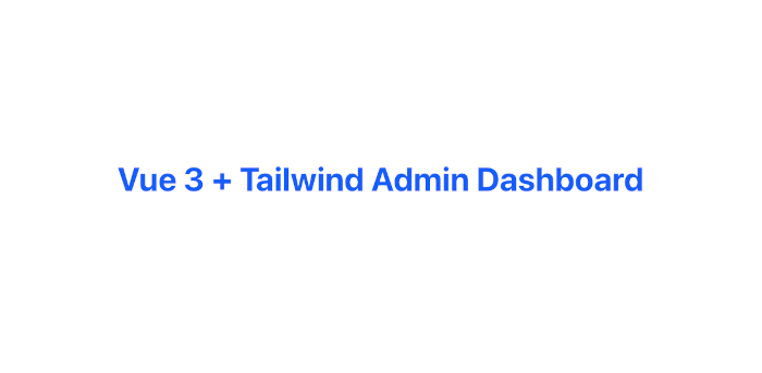
If you see a large blue heading, Tailwind is working correctly 🎉.
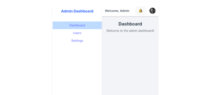
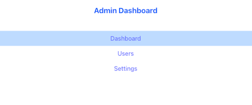
Layout Structure (Sidebar + Navbar)
A typical admin dashboard layout includes:
-
Sidebar navigation for primary links (Dashboard, Users, Settings).
-
Top navigation bar for secondary actions (profile menu, notifications).
-
Main content area where the pages render.
We’ll create a flexible layout using Vue components and Tailwind utilities.
Step 1: Setup Vue Router
First, install Vue Router so we can navigate between pages.
npm install vue-routerCreate a src/router/index.ts:
import { createRouter, createWebHistory, RouteRecordRaw } from 'vue-router'
import Dashboard from '../views/Dashboard.vue'
import Users from '../views/Users.vue'
import Settings from '../views/Settings.vue'

const routes: Array<RouteRecordRaw> = [
  { path: '/', name: 'Dashboard', component: Dashboard },
  { path: '/users', name: 'Users', component: Users },
  { path: '/settings', name: 'Settings', component: Settings },
]

const router = createRouter({
  history: createWebHistory(import.meta.env.BASE_URL),
  routes,
})

export default router
Update main.ts:
import { createApp } from 'vue'
import App from './App.vue'
import router from './router'
import './style.css'

createApp(App).use(router).mount('#app')
Create src/shims-vue.d.ts
declare module '*.vue' {
    import type { DefineComponent } from 'vue'
    const component: DefineComponent<{}, {}, any>
    export default component
}
Step 2: Create Layout Component
src/components/Layout.vue:
<template>
  <div class="flex h-screen bg-gray-100">
    <!-- Sidebar -->
    <aside class="w-64 bg-white shadow-md hidden md:block">
      <div class="p-4 text-xl font-bold text-blue-600">
        Admin Dashboard
      </div>
      <nav class="mt-6">
        <RouterLink
          to="/"
          class="block px-4 py-2 hover:bg-blue-100"
          active-class="bg-blue-200 font-semibold"
        >
          Dashboard
        </RouterLink>
        <RouterLink
          to="/users"
          class="block px-4 py-2 hover:bg-blue-100"
          active-class="bg-blue-200 font-semibold"
        >
          Users
        </RouterLink>
        <RouterLink
          to="/settings"
          class="block px-4 py-2 hover:bg-blue-100"
          active-class="bg-blue-200 font-semibold"
        >
          Settings
        </RouterLink>
      </nav>
    </aside>

    <!-- Main Content -->
    <div class="flex-1 flex flex-col">
      <!-- Top Navbar -->
      <header class="bg-white shadow-md h-14 flex items-center justify-between px-4">
        <button
          class="md:hidden text-gray-600"
          @click="toggleSidebar"
        >
          ☰
        </button>
        <div class="font-semibold">Welcome, Admin</div>
        <div class="flex items-center space-x-4">
          <button class="text-gray-600 hover:text-blue-600">🔔</button>
          <img
            src="https://i.pravatar.cc/40"
            alt="User Avatar"
            class="w-8 h-8 rounded-full"
          />
        </div>
      </header>

      <!-- Router View -->
      <main class="p-6 overflow-y-auto">
        <RouterView />
      </main>
    </div>
  </div>
</template>

<script setup lang="ts">
import { ref } from 'vue'
import { RouterLink, RouterView } from 'vue-router'

const sidebarOpen = ref(false)

function toggleSidebar(): void {
  sidebarOpen.value = !sidebarOpen.value
}
</script>
Step 3: Wrap Pages with Layout
App.vue:
<template>
  <Layout />
</template>

<script setup lang="ts">
import Layout from './components/Layout.vue'
</script>
Step 4: Add Example Pages
Inside src/views/:
Dashboard.vue
<template>
  <h2 class="text-2xl font-bold">Dashboard</h2>
  <p class="mt-2 text-gray-600">Welcome to the admin dashboard!</p>
</template>

<script setup lang="ts"></script>
Users.vue
<template>
  <h2 class="text-2xl font-bold">Users</h2>
  <p class="mt-2 text-gray-600">Manage your users here.</p>
</template>

<script setup lang="ts"></script>
Settings.vue
<template>
  <h2 class="text-2xl font-bold">Settings</h2>
  <p class="mt-2 text-gray-600">Update your preferences here.</p>
</template>

<script setup lang="ts"></script>
You’ll have a Sidebar, Navbar, and Router-based navigation.
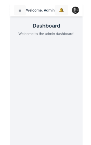
Sidebar Responsiveness (Collapsible on Mobile)
Currently, the sidebar is always visible on desktop (md:block) but hidden on mobile. We’ll add a mobile drawer sidebar that slides in/out when toggled.
Step 1: Update Layout.vue
We’ll modify Layout.vue to support two sidebar versions:
-
Desktop sidebar → always visible on
md+screens -
Mobile sidebar → slides in when
sidebarOpenistrue
<template>
  <div class="flex h-screen bg-gray-100">
    <!-- Mobile Sidebar -->
    <transition name="slide">
      <aside
        v-if="sidebarOpen"
        class="fixed inset-0 z-40 flex md:hidden"
      >
        <!-- Overlay -->
        <div
          class="fixed inset-0 bg-black bg-opacity-50"
          @click="toggleSidebar"
        ></div>

        <!-- Sidebar -->
        <div class="relative flex-1 flex flex-col w-64 bg-white shadow-md">
          <div class="p-4 text-xl font-bold text-blue-600">
            Admin Dashboard
          </div>
          <nav class="mt-6">
            <RouterLink
              to="/"
              class="block px-4 py-2 hover:bg-blue-100"
              active-class="bg-blue-200 font-semibold"
              @click="toggleSidebar"
            >
              Dashboard
            </RouterLink>
            <RouterLink
              to="/users"
              class="block px-4 py-2 hover:bg-blue-100"
              active-class="bg-blue-200 font-semibold"
              @click="toggleSidebar"
            >
              Users
            </RouterLink>
            <RouterLink
              to="/settings"
              class="block px-4 py-2 hover:bg-blue-100"
              active-class="bg-blue-200 font-semibold"
              @click="toggleSidebar"
            >
              Settings
            </RouterLink>
          </nav>
        </div>
      </aside>
    </transition>

    <!-- Desktop Sidebar -->
    <aside class="w-64 bg-white shadow-md hidden md:block">
      <div class="p-4 text-xl font-bold text-blue-600">
        Admin Dashboard
      </div>
      <nav class="mt-6">
        <RouterLink
          to="/"
          class="block px-4 py-2 hover:bg-blue-100"
          active-class="bg-blue-200 font-semibold"
        >
          Dashboard
        </RouterLink>
        <RouterLink
          to="/users"
          class="block px-4 py-2 hover:bg-blue-100"
          active-class="bg-blue-200 font-semibold"
        >
          Users
        </RouterLink>
        <RouterLink
          to="/settings"
          class="block px-4 py-2 hover:bg-blue-100"
          active-class="bg-blue-200 font-semibold"
        >
          Settings
        </RouterLink>
      </nav>
    </aside>

    <!-- Main Content -->
    <div class="flex-1 flex flex-col">
      <!-- Top Navbar -->
      <header class="bg-white shadow-md h-14 flex items-center justify-between px-4">
        <!-- Mobile Menu Button -->
        <button
          class="md:hidden text-gray-600"
          @click="toggleSidebar"
        >
          ☰
        </button>
        <div class="font-semibold">Welcome, Admin</div>
        <div class="flex items-center space-x-4">
          <button class="text-gray-600 hover:text-blue-600">🔔</button>
          <img
            src="https://i.pravatar.cc/40"
            alt="User Avatar"
            class="w-8 h-8 rounded-full"
          />
        </div>
      </header>

      <!-- Router View -->
      <main class="p-6 overflow-y-auto">
        <RouterView />
      </main>
    </div>
  </div>
</template>

<script setup lang="ts">
import { ref } from 'vue'
import { RouterLink, RouterView } from 'vue-router'

const sidebarOpen = ref(false)

function toggleSidebar(): void {
  sidebarOpen.value = !sidebarOpen.value
}
</script>

<style scoped>
.slide-enter-active,
.slide-leave-active {
  transition: transform 0.3s ease;
}
.slide-enter-from {
  transform: translateX(-100%);
}
.slide-leave-to {
  transform: translateX(-100%);
}
</style>
Step 2: How it Works
-
On mobile (
md:hidden), the sidebar is hidden by default. -
Clicking the ☰ button toggles
sidebarOpen. -
When open, a dark overlay covers the screen, and the sidebar slides in.
-
On desktop (
md:block), the sidebar is always visible.
Step 3: Test Responsiveness
-
Resize the browser to mobile width → sidebar should collapse.
-
Click ☰ → sidebar slides in with overlay.
-
Click outside overlay → sidebar closes.
-
On the desktop, the sidebar should remain fixed on the left.
✅ Now the sidebar is fully responsive and mobile-friendly.
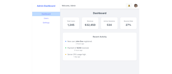
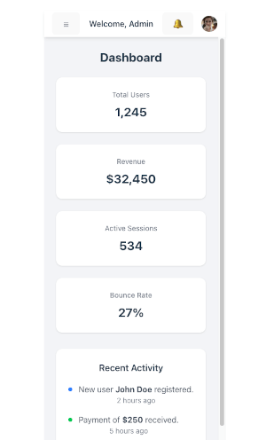
Dashboard Widgets (Stats Cards & Activity Section)
The dashboard typically begins with summary statistics (e.g., users, revenue, performance) and an activity section that highlights recent actions or updates. We’ll build both with Tailwind CSS.
Step 1: Update Dashboard.vue
src/views/Dashboard.vue
<template>
  <div>
    <!-- Title -->
    <h2 class="text-2xl font-bold mb-6">Dashboard</h2>

    <!-- Stats Cards -->
    <div class="grid gap-6 md:grid-cols-2 lg:grid-cols-4 mb-8">
      <div class="bg-white p-6 rounded-xl shadow">
        <p class="text-sm font-medium text-gray-500">Total Users</p>
        <p class="text-2xl font-bold mt-2">1,245</p>
      </div>

      <div class="bg-white p-6 rounded-xl shadow">
        <p class="text-sm font-medium text-gray-500">Revenue</p>
        <p class="text-2xl font-bold mt-2">$32,450</p>
      </div>

      <div class="bg-white p-6 rounded-xl shadow">
        <p class="text-sm font-medium text-gray-500">Active Sessions</p>
        <p class="text-2xl font-bold mt-2">534</p>
      </div>

      <div class="bg-white p-6 rounded-xl shadow">
        <p class="text-sm font-medium text-gray-500">Bounce Rate</p>
        <p class="text-2xl font-bold mt-2">27%</p>
      </div>
    </div>

    <!-- Recent Activity -->
    <div class="bg-white p-6 rounded-xl shadow">
      <h3 class="text-lg font-semibold mb-4">Recent Activity</h3>
      <ul class="space-y-4">
        <li class="flex items-start">
          <span class="w-2 h-2 mt-2 rounded-full bg-blue-500"></span>
          <p class="ml-3 text-gray-700">
            New user <strong>John Doe</strong> registered.
            <span class="block text-sm text-gray-500">2 hours ago</span>
          </p>
        </li>
        <li class="flex items-start">
          <span class="w-2 h-2 mt-2 rounded-full bg-green-500"></span>
          <p class="ml-3 text-gray-700">
            Payment of <strong>$250</strong> received.
            <span class="block text-sm text-gray-500">5 hours ago</span>
          </p>
        </li>
        <li class="flex items-start">
          <span class="w-2 h-2 mt-2 rounded-full bg-yellow-500"></span>
          <p class="ml-3 text-gray-700">
            Server CPU usage high.
            <span class="block text-sm text-gray-500">1 day ago</span>
          </p>
        </li>
      </ul>
    </div>
  </div>
</template>

<script setup lang="ts">
// In a real app, these would come from an API.
</script>
Step 2: Features
-
Stats Cards: Responsive grid (1 column on mobile, up to 4 on large screens).
-
Recent Activity: Clean list with colored indicators.
-
Fully styled with Tailwind utilities.
-
The data is static now, but it can later be replaced with API-driven values.
Step 3: Optional Enhancements
-
Add icons (e.g., from Heroicons) inside cards.
-
Use dynamic props if you want reusable
<StatCard /><ActivityItem />components. -
Integrate a chart (Chart.js, ApexCharts) for visual representation.
✅ Now your dashboard looks like a real admin panel with stats + activity tracking.
Adding a Chart to the Dashboard (ApexCharts)
Step 1: Install ApexCharts + Vue Wrapper
npm install apexcharts vue3-apexchartsStep 2: Register ApexCharts Globally
In main.ts, register the component globally:
import { createApp } from 'vue'
import App from './App.vue'
import router from './router'
import './style.css'

import VueApexCharts from 'vue3-apexcharts'

const app = createApp(App)

app.use(router)

// Register ApexCharts globally
app.component('apexchart', VueApexCharts)

app.mount('#app')
Now you can use <apexchart /> anywhere.
Step 3: Add Chart to Dashboard
Modify src/views/Dashboard.vue:
<template>
  <div>
    <!-- Title -->
    <h2 class="text-2xl font-bold mb-6">Dashboard</h2>

    <!-- Stats Cards -->
    <div class="grid gap-6 md:grid-cols-2 lg:grid-cols-4 mb-8">
      <div class="bg-white p-6 rounded-xl shadow">
        <p class="text-sm font-medium text-gray-500">Total Users</p>
        <p class="text-2xl font-bold mt-2">1,245</p>
      </div>

      <div class="bg-white p-6 rounded-xl shadow">
        <p class="text-sm font-medium text-gray-500">Revenue</p>
        <p class="text-2xl font-bold mt-2">$32,450</p>
      </div>

      <div class="bg-white p-6 rounded-xl shadow">
        <p class="text-sm font-medium text-gray-500">Active Sessions</p>
        <p class="text-2xl font-bold mt-2">534</p>
      </div>

      <div class="bg-white p-6 rounded-xl shadow">
        <p class="text-sm font-medium text-gray-500">Bounce Rate</p>
        <p class="text-2xl font-bold mt-2">27%</p>
      </div>
    </div>

    <!-- Chart -->
    <div class="bg-white p-6 rounded-xl shadow mb-8">
      <h3 class="text-lg font-semibold mb-4">Monthly Users Growth</h3>
      <apexchart
        width="100%"
        type="line"
        :options="chartOptions"
        :series="series"
      />
    </div>

    <!-- Recent Activity -->
    <div class="bg-white p-6 rounded-xl shadow">
      <h3 class="text-lg font-semibold mb-4">Recent Activity</h3>
      <ul class="space-y-4">
        <li class="flex items-start">
          <span class="w-2 h-2 mt-2 rounded-full bg-blue-500"></span>
          <p class="ml-3 text-gray-700">
            New user <strong>John Doe</strong> registered.
            <span class="block text-sm text-gray-500">2 hours ago</span>
          </p>
        </li>
        <li class="flex items-start">
          <span class="w-2 h-2 mt-2 rounded-full bg-green-500"></span>
          <p class="ml-3 text-gray-700">
            Payment of <strong>$250</strong> received.
            <span class="block text-sm text-gray-500">5 hours ago</span>
          </p>
        </li>
        <li class="flex items-start">
          <span class="w-2 h-2 mt-2 rounded-full bg-yellow-500"></span>
          <p class="ml-3 text-gray-700">
            Server CPU usage high.
            <span class="block text-sm text-gray-500">1 day ago</span>
          </p>
        </li>
      </ul>
    </div>
  </div>
</template>

<script setup lang="ts">
import { ref } from 'vue'

const series = ref([
  {
    name: 'Users',
    data: [120, 200, 340, 280, 450, 600, 750, 900, 1200, 1400, 1600, 1800],
  },
])

const chartOptions = ref({
  chart: {
    id: 'users-growth',
    toolbar: { show: false },
  },
  xaxis: {
    categories: [
      'Jan', 'Feb', 'Mar', 'Apr', 'May', 'Jun',
      'Jul', 'Aug', 'Sep', 'Oct', 'Nov', 'Dec'
    ],
  },
  colors: ['#3b82f6'], // Tailwind blue-500
  stroke: {
    curve: 'smooth',
    width: 3,
  },
  dataLabels: {
    enabled: false,
  },
  grid: {
    borderColor: '#e5e7eb', // Tailwind gray-200
  },
})
</script>
Step 4: Test
-
You should now see a smooth line chart showing monthly users' growth.
-
Fully responsive: the chart adjusts width automatically.
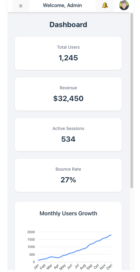
✅ Now your Dashboard includes stats cards, a growth chart, and recent activity → a solid foundation for a professional admin dashboard.
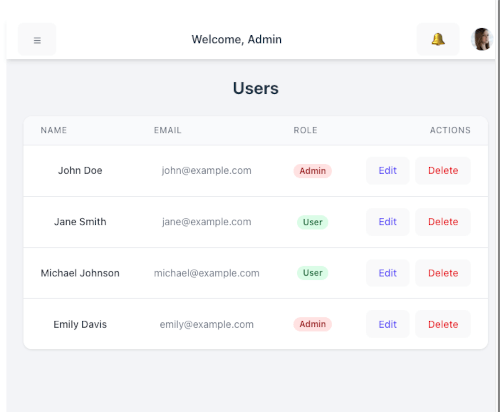
Users Page (Responsive Data Table with Sample Users)
We’ll display a list of users in a styled Tailwind table that adapts to mobile (stacked layout) and desktop (classic table).
Step 1: Create Users.vue
src/views/Users.vue
<template>
  <div>
    <h2 class="text-2xl font-bold mb-6">Users</h2>

    <div class="overflow-x-auto bg-white shadow rounded-xl">
      <table class="min-w-full divide-y divide-gray-200">
        <thead class="bg-gray-50">
          <tr>
            <th
              scope="col"
              class="px-6 py-3 text-left text-xs font-medium text-gray-500 uppercase tracking-wider"
            >
              Name
            </th>
            <th
              scope="col"
              class="px-6 py-3 text-left text-xs font-medium text-gray-500 uppercase tracking-wider"
            >
              Email
            </th>
            <th
              scope="col"
              class="px-6 py-3 text-left text-xs font-medium text-gray-500 uppercase tracking-wider"
            >
              Role
            </th>
            <th scope="col" class="px-6 py-3 text-right text-xs font-medium text-gray-500 uppercase tracking-wider">
              Actions
            </th>
          </tr>
        </thead>
        <tbody class="bg-white divide-y divide-gray-200">
          <tr v-for="user in users" :key="user.id">
            <td class="px-6 py-4 whitespace-nowrap text-sm font-medium text-gray-900">
              {{ user.name }}
            </td>
            <td class="px-6 py-4 whitespace-nowrap text-sm text-gray-500">
              {{ user.email }}
            </td>
            <td class="px-6 py-4 whitespace-nowrap text-sm text-gray-500">
              <span
                :class="[
                  'px-2 inline-flex text-xs leading-5 font-semibold rounded-full',
                  user.role === 'Admin'
                    ? 'bg-red-100 text-red-800'
                    : 'bg-green-100 text-green-800',
                ]"
              >
                {{ user.role }}
              </span>
            </td>
            <td class="px-6 py-4 whitespace-nowrap text-right text-sm font-medium">
              <button class="text-indigo-600 hover:text-indigo-900 mr-2">Edit</button>
              <button class="text-red-600 hover:text-red-900">Delete</button>
            </td>
          </tr>
        </tbody>
      </table>
    </div>
  </div>
</template>

<script setup lang="ts">
interface User {
  id: number
  name: string
  email: string
  role: 'Admin' | 'User'
}

const users: User[] = [
  { id: 1, name: 'John Doe', email: '[email protected]', role: 'Admin' },
  { id: 2, name: 'Jane Smith', email: '[email protected]', role: 'User' },
  { id: 3, name: 'Michael Johnson', email: '[email protected]', role: 'User' },
  { id: 4, name: 'Emily Davis', email: '[email protected]', role: 'Admin' },
]
</script>
Step 2: Add Route
src/router/index.ts
import { createRouter, createWebHistory, type RouteRecordRaw } from 'vue-router'
import Dashboard from '../views/Dashboard.vue'
import Users from '../views/Users.vue'
import Settings from '../views/Settings.vue'

const routes: Array<RouteRecordRaw> = [
    { path: '/', name: 'Dashboard', component: Dashboard },
    { path: '/users', name: 'Users', component: Users },
    { path: '/settings', name: 'Settings', component: Settings },
]

const router = createRouter({
    history: createWebHistory(import.meta.env.BASE_URL),
    routes,
})

export default router
Step 3: Update Sidebar
Add a link in Layout.vue:
            <RouterLink
              to="/users"
              class="block px-4 py-2 hover:bg-blue-100"
              active-class="bg-blue-200 font-semibold"
              @click="toggleSidebar"
            >
              Users
            </RouterLink>
✅ You now have a Users Page with a responsive Tailwind table and sample users. On mobile, the table scrolls horizontally, while on larger screens, it looks like a standard data table.
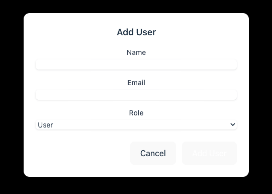
Add/Edit User Form (Modal)
We’ll add:
-
“Add User” button above the table.
-
Modal component for the form.
-
Ability to open the modal for a new user or edit an existing user.
-
Simple local state (not backend yet).
Step 1: Create UserFormModal.vue
src/components/UserFormModal.vue
<template>
  <div
    v-if="isOpen"
    class="fixed inset-0 flex items-center justify-center bg-black bg-opacity-50 z-50"
  >
    <div class="bg-white rounded-xl shadow-lg w-full max-w-md p-6 relative">
      <h3 class="text-lg font-semibold mb-4">
        {{ isEdit ? 'Edit User' : 'Add User' }}
      </h3>

      <form @submit.prevent="handleSubmit" class="space-y-4">
        <!-- Name -->
        <div>
          <label class="block text-sm font-medium text-gray-700">Name</label>
          <input
            v-model="formData.name"
            type="text"
            required
            class="mt-1 block w-full rounded-md border-gray-300 shadow-sm focus:ring-indigo-500 focus:border-indigo-500 sm:text-sm"
          />
        </div>

        <!-- Email -->
        <div>
          <label class="block text-sm font-medium text-gray-700">Email</label>
          <input
            v-model="formData.email"
            type="email"
            required
            class="mt-1 block w-full rounded-md border-gray-300 shadow-sm focus:ring-indigo-500 focus:border-indigo-500 sm:text-sm"
          />
        </div>

        <!-- Role -->
        <div>
          <label class="block text-sm font-medium text-gray-700">Role</label>
          <select
            v-model="formData.role"
            required
            class="mt-1 block w-full rounded-md border-gray-300 shadow-sm focus:ring-indigo-500 focus:border-indigo-500 sm:text-sm"
          >
            <option value="Admin">Admin</option>
            <option value="User">User</option>
          </select>
        </div>

        <!-- Actions -->
        <div class="flex justify-end space-x-3 mt-6">
          <button
            type="button"
            class="px-4 py-2 rounded-md bg-gray-200 hover:bg-gray-300"
            @click="closeModal"
          >
            Cancel
          </button>
          <button
            type="submit"
            class="px-4 py-2 rounded-md bg-indigo-600 text-white hover:bg-indigo-700"
          >
            {{ isEdit ? 'Save Changes' : 'Add User' }}
          </button>
        </div>
      </form>
    </div>
  </div>
</template>

<script setup lang="ts">
import { ref, watch, defineProps, defineEmits } from 'vue'

interface User {
  id?: number
  name: string
  email: string
  role: 'Admin' | 'User'
}

const props = defineProps<{
  isOpen: boolean
  isEdit: boolean
  user: User | null
}>()

const emit = defineEmits<{
  (e: 'close'): void
  (e: 'save', user: User): void
}>()

const formData = ref<User>({
  name: '',
  email: '',
  role: 'User',
})

watch(
  () => props.user,
  (newUser) => {
    if (newUser) {
      formData.value = { ...newUser }
    } else {
      formData.value = { name: '', email: '', role: 'User' }
    }
  },
  { immediate: true }
)

const handleSubmit = () => {
  emit('save', { ...formData.value })
  closeModal()
}

const closeModal = () => {
  emit('close')
}
</script>
Step 2: Update Users.vue
Add state + modal integration.
<template>
  <div>
    <h2 class="text-2xl font-bold mb-6">Users</h2>

    <!-- Add User Button -->
    <div class="mb-4 flex justify-end">
      <button
        class="px-4 py-2 rounded-md bg-indigo-600 text-white hover:bg-indigo-700"
        @click="openAddModal"
      >
        + Add User
      </button>
    </div>

    <!-- Table -->
    <div class="overflow-x-auto bg-white shadow rounded-xl">
      <table class="min-w-full divide-y divide-gray-200">
        <thead class="bg-gray-50">
          <tr>
            <th class="px-6 py-3 text-left text-xs font-medium text-gray-500 uppercase tracking-wider">
              Name
            </th>
            <th class="px-6 py-3 text-left text-xs font-medium text-gray-500 uppercase tracking-wider">
              Email
            </th>
            <th class="px-6 py-3 text-left text-xs font-medium text-gray-500 uppercase tracking-wider">
              Role
            </th>
            <th class="px-6 py-3 text-right text-xs font-medium text-gray-500 uppercase tracking-wider">
              Actions
            </th>
          </tr>
        </thead>
        <tbody class="bg-white divide-y divide-gray-200">
          <tr v-for="user in users" :key="user.id">
            <td class="px-6 py-4 whitespace-nowrap text-sm font-medium text-gray-900">
              {{ user.name }}
            </td>
            <td class="px-6 py-4 whitespace-nowrap text-sm text-gray-500">
              {{ user.email }}
            </td>
            <td class="px-6 py-4 whitespace-nowrap text-sm">
              <span
                :class="[
                  'px-2 inline-flex text-xs leading-5 font-semibold rounded-full',
                  user.role === 'Admin'
                    ? 'bg-red-100 text-red-800'
                    : 'bg-green-100 text-green-800',
                ]"
              >
                {{ user.role }}
              </span>
            </td>
            <td class="px-6 py-4 whitespace-nowrap text-right text-sm font-medium">
              <button
                class="text-indigo-600 hover:text-indigo-900 mr-2"
                @click="openEditModal(user)"
              >
                Edit
              </button>
              <button
                class="text-red-600 hover:text-red-900"
                @click="deleteUser(user.id)"
              >
                Delete
              </button>
            </td>
          </tr>
        </tbody>
      </table>
    </div>

    <!-- User Form Modal -->
    <UserFormModal
      :isOpen="isModalOpen"
      :isEdit="isEditMode"
      :user="selectedUser"
      @close="closeModal"
      @save="saveUser"
    />
  </div>
</template>

<script setup lang="ts">
import { ref } from 'vue'
import UserFormModal from '../components/UserFormModal.vue'

interface User {
  id: number
  name: string
  email: string
  role: 'Admin' | 'User'
}

const users = ref<User[]>([
  { id: 1, name: 'John Doe', email: '[email protected]', role: 'Admin' },
  { id: 2, name: 'Jane Smith', email: '[email protected]', role: 'User' },
])

const isModalOpen = ref(false)
const isEditMode = ref(false)
const selectedUser = ref<User | null>(null)

const openAddModal = () => {
  selectedUser.value = null
  isEditMode.value = false
  isModalOpen.value = true
}

const openEditModal = (user: User) => {
  selectedUser.value = { ...user }
  isEditMode.value = true
  isModalOpen.value = true
}

const closeModal = () => {
  isModalOpen.value = false
}

const saveUser = (user: User) => {
  if (isEditMode.value && selectedUser.value) {
    const index = users.value.findIndex((u) => u.id === selectedUser.value?.id)
    if (index !== -1) {
      users.value[index] = { ...users.value[index], ...user }
    }
  } else {
    const newId = users.value.length + 1
    users.value.push({ id: newId, ...user })
  }
}
const deleteUser = (id: number) => {
  users.value = users.value.filter((u) => u.id !== id)
}
</script>
✅ Now you have a fully working Add/Edit User modal.
-
Click “+ Add User” → opens form.
-
Click “Edit” → opens form with pre-filled data.
-
Changes are reflected in the table (local state).
Authentication (Login Page + Protected Routes)
1. Auth Store (Pinia)
Install Pinia:
npm install pinia Create a new store auth.ts under src/stores/:
// src/stores/auth.ts
import { defineStore } from 'pinia'
import { ref } from 'vue'

interface User {
  id: number
  username: string
  token: string
}

export const useAuthStore = defineStore('auth', () => {
  const user = ref<User | null>(null)

  function login(username: string, password: string) {
    // Replace this mock login with your API call
    if (username === 'admin' && password === 'password') {
      user.value = {
        id: 1,
        username,
        token: 'mock-jwt-token'
      }
      localStorage.setItem('user', JSON.stringify(user.value))
      return true
    }
    return false
  }

  function logout() {
    user.value = null
    localStorage.removeItem('user')
  }

  function loadUser() {
    const stored = localStorage.getItem('user')
    if (stored) {
      user.value = JSON.parse(stored)
    }
  }

  return { user, login, logout, loadUser }
})
👉 This store manages the authentication state and persists it in localStorage.
2. Login Page Component
Create src/views/Login.vue:
<template>
  <div class="flex justify-center items-center h-screen bg-gray-100">
    <div class="bg-white p-8 rounded-lg shadow-md w-96">
      <h1 class="text-2xl font-bold mb-6 text-center">Login</h1>

      <form @submit.prevent="handleLogin">
        <div class="mb-4">
          <label class="block text-sm font-medium mb-1">Username</label>
          <input
            v-model="username"
            type="text"
            class="w-full border border-gray-300 p-2 rounded"
          />
        </div>

        <div class="mb-4">
          <label class="block text-sm font-medium mb-1">Password</label>
          <input
            v-model="password"
            type="password"
            class="w-full border border-gray-300 p-2 rounded"
          />
        </div>

        <button
          type="submit"
          class="w-full bg-blue-600 text-white py-2 rounded hover:bg-blue-700"
        >
          Login
        </button>
      </form>

      <p v-if="error" class="text-red-600 mt-4 text-center">{{ error }}</p>
    </div>
  </div>
</template>

<script setup lang="ts">
import { ref } from 'vue'
import { useRouter } from 'vue-router'
import { useAuthStore } from '../stores/auth'

const username = ref('')
const password = ref('')
const error = ref('')
const router = useRouter()
const auth = useAuthStore()

const handleLogin = () => {
  const success = auth.login(username.value, password.value)
  if (success) {
    router.push('/')
  } else {
    error.value = 'Invalid username or password'
  }
}
</script>
3. Protected Routes with Vue Router
Update src/router/index.ts:
import { createRouter, createWebHistory, type RouteRecordRaw } from 'vue-router'
import Dashboard from '../views/Dashboard.vue'
import Users from '../views/Users.vue'
import Settings from '../views/Settings.vue'
import Login from '../views/Login.vue'

const routes: Array<RouteRecordRaw> = [
    { path: '/', name: 'Dashboard', component: Dashboard },
    { path: '/login', name: 'Login', component: Login },
    { path: '/', name: 'Users', component: Users, meta: { requiresAuth: true } },
    { path: '/settings', name: 'Settings', component: Settings },
]

const router = createRouter({
    history: createWebHistory(import.meta.env.BASE_URL),
    routes,
})

export default router
4. Add Logout Button
Update Users.vue (or a Navbar.vue if you have one):
<template>
  <div>
    <h2 class="text-2xl font-bold mb-6">Users</h2>

    <!-- Add User Button -->
    <div class="mb-4 flex justify-end">
      <button
        class="px-4 py-2 rounded-md bg-indigo-600 text-white hover:bg-indigo-700"
        @click="openAddModal"
      >
        + Add User
      </button>
    </div>
    <div class="mb-4 flex justify-end">
      <button
        @click="logout"
        class="bg-red-600 text-white px-3 py-1 rounded hover:bg-red-700"
      >
        Logout
      </button>
    </div>

    <!-- Table -->
    <div class="overflow-x-auto bg-white shadow rounded-xl">
      <table class="min-w-full divide-y divide-gray-200">
        <thead class="bg-gray-50">
          <tr>
            <th class="px-6 py-3 text-left text-xs font-medium text-gray-500 uppercase tracking-wider">
              Name
            </th>
            <th class="px-6 py-3 text-left text-xs font-medium text-gray-500 uppercase tracking-wider">
              Email
            </th>
            <th class="px-6 py-3 text-left text-xs font-medium text-gray-500 uppercase tracking-wider">
              Role
            </th>
            <th class="px-6 py-3 text-right text-xs font-medium text-gray-500 uppercase tracking-wider">
              Actions
            </th>
          </tr>
        </thead>
        <tbody class="bg-white divide-y divide-gray-200">
          <tr v-for="user in users" :key="user.id">
            <td class="px-6 py-4 whitespace-nowrap text-sm font-medium text-gray-900">
              {{ user.name }}
            </td>
            <td class="px-6 py-4 whitespace-nowrap text-sm text-gray-500">
              {{ user.email }}
            </td>
            <td class="px-6 py-4 whitespace-nowrap text-sm">
              <span
                :class="[
                  'px-2 inline-flex text-xs leading-5 font-semibold rounded-full',
                  user.role === 'Admin'
                    ? 'bg-red-100 text-red-800'
                    : 'bg-green-100 text-green-800',
                ]"
              >
                {{ user.role }}
              </span>
            </td>
            <td class="px-6 py-4 whitespace-nowrap text-right text-sm font-medium">
              <button
                class="text-indigo-600 hover:text-indigo-900 mr-2"
                @click="openEditModal(user)"
              >
                Edit
              </button>
              <button
                class="text-red-600 hover:text-red-900"
                @click="deleteUser(user.id)"
              >
                Delete
              </button>
            </td>
          </tr>
        </tbody>
      </table>
    </div>

    <!-- User Form Modal -->
    <UserFormModal
      :isOpen="isModalOpen"
      :isEdit="isEditMode"
      :user="selectedUser"
      @close="closeModal"
      @save="saveUser"
    />
  </div>
</template>

<script setup lang="ts">
import { ref } from 'vue'
import UserFormModal from '../components/UserFormModal.vue'
import { useRouter } from 'vue-router'
import { useAuthStore } from '../stores/auth'

interface User {
  id: number
  name: string
  email: string
  role: 'Admin' | 'User'
}

interface UserForm {
  id?: number
  name: string
  email: string
  role: 'Admin' | 'User'
}

const users = ref<User[]>([
  { id: 1, name: 'John Doe', email: '[email protected]', role: 'Admin' },
  { id: 2, name: 'Jane Smith', email: '[email protected]', role: 'User' },
])

const isModalOpen = ref(false)
const isEditMode = ref(false)
const selectedUser = ref<User | null>(null)

const openAddModal = () => {
  selectedUser.value = null
  isEditMode.value = false
  isModalOpen.value = true
}

const openEditModal = (user: User) => {
  selectedUser.value = { ...user }
  isEditMode.value = true
  isModalOpen.value = true
}

const closeModal = () => {
  isModalOpen.value = false
}

const saveUser = (user: UserForm) => {
  if (isEditMode.value && selectedUser.value) {
    // Update existing user
    const index = users.value.findIndex((u) => u.id === selectedUser.value?.id)
    if (index !== -1) {
      users.value[index] = { ...users.value[index], ...user } as User
    }
  } else {
    // Add new user
    const newId = users.value.length + 1
    users.value.push({ id: newId, ...user } as User)
  }
}
const deleteUser = (id: number) => {
  users.value = users.value.filter((u) => u.id !== id)
}

const auth = useAuthStore()
const router = useRouter()

const logout = () => {
  auth.logout()
  router.push('/login')
}
</script>
✅ With this setup:
-
Users must log in before accessing
/(Users list). -
Unauthenticated users are redirected to
/login. -
The login persists with
localStorage. -
Logout clears the session and redirects to login.
Enhance the UX Around Authentication
1. Navbar User Menu
Update your Layout.vue to connect with the auth store.
<template>
  <div class="flex h-screen bg-gray-100">
    <!-- Mobile Sidebar -->
    <transition name="slide">
      <aside
        v-if="sidebarOpen"
        class="fixed inset-0 z-40 flex md:hidden"
      >
        <!-- Overlay -->
        <div
          class="fixed inset-0 bg-black bg-opacity-50"
          @click="toggleSidebar"
        ></div>

        <!-- Sidebar -->
        <div class="relative flex-1 flex flex-col w-64 bg-white shadow-md">
          <div class="p-4 text-xl font-bold text-blue-600">
            Admin Dashboard
          </div>
          <div v-if="auth.user">
            <div class="flex items-center space-x-4">
                <span class="text-gray-700">Hello, {{ auth.user?.username }}</span>
                <button
                @click="auth.logout"
                class="bg-red-500 text-white px-3 py-1 rounded hover:bg-red-600"
                >
                Logout
                </button>
            </div>
          </div>
          <nav class="mt-6">
            <RouterLink
              to="/"
              class="block px-4 py-2 hover:bg-blue-100"
              active-class="bg-blue-200 font-semibold"
              @click="toggleSidebar"
            >
              Dashboard
            </RouterLink>
            <RouterLink
              to="/users"
              class="block px-4 py-2 hover:bg-blue-100"
              active-class="bg-blue-200 font-semibold"
              @click="toggleSidebar"
            >
              Users
            </RouterLink>
            <RouterLink
              to="/settings"
              class="block px-4 py-2 hover:bg-blue-100"
              active-class="bg-blue-200 font-semibold"
              @click="toggleSidebar"
            >
              Settings
            </RouterLink>
          </nav>
        </div>
      </aside>
    </transition>

    <!-- Desktop Sidebar -->
    <aside class="w-64 bg-white shadow-md hidden md:block">
      <div class="p-4 text-xl font-bold text-blue-600">
        Admin Dashboard
      </div>
      <nav class="mt-6">
        <RouterLink
          to="/"
          class="block px-4 py-2 hover:bg-blue-100"
          active-class="bg-blue-200 font-semibold"
        >
          Dashboard
        </RouterLink>
        <RouterLink
          to="/users"
          class="block px-4 py-2 hover:bg-blue-100"
          active-class="bg-blue-200 font-semibold"
        >
          Users
        </RouterLink>
        <RouterLink
          to="/settings"
          class="block px-4 py-2 hover:bg-blue-100"
          active-class="bg-blue-200 font-semibold"
        >
          Settings
        </RouterLink>
      </nav>
    </aside>

    <!-- Main Content -->
    <div class="flex-1 flex flex-col">
      <!-- Top Navbar -->
      <header class="bg-white shadow-md h-14 flex items-center justify-between px-4">
        <!-- Mobile Menu Button -->
        <button
          class="md:hidden text-gray-600"
          @click="toggleSidebar"
        >
          ☰
        </button>
        <div class="font-semibold">Welcome, Admin</div>
        <div class="flex items-center space-x-4">
          <button class="text-gray-600 hover:text-blue-600">🔔</button>
          <img
            src="https://i.pravatar.cc/40"
            alt="User Avatar"
            class="w-8 h-8 rounded-full"
          />
        </div>
      </header>

      <!-- Router View -->
      <main class="p-6 overflow-y-auto">
        <RouterView />
      </main>
    </div>
  </div>
</template>

<script setup lang="ts">
import { ref } from 'vue'
import { RouterLink, RouterView } from 'vue-router'
import { useAuthStore } from '../stores/auth'

const auth = useAuthStore()
const sidebarOpen = ref(false)

function toggleSidebar(): void {
  sidebarOpen.value = !sidebarOpen.value
}
</script>

<style scoped>
.slide-enter-active,
.slide-leave-active {
  transition: transform 0.3s ease;
}
.slide-enter-from {
  transform: translateX(-100%);
}
.slide-leave-to {
  transform: translateX(-100%);
}
</style>
Now the navbar will dynamically show the user’s name and the logout button when logged in.
2. Redirect Back After Login
Update router/index.ts to capture the redirect path.
import { createRouter, createWebHistory, type RouteRecordRaw } from 'vue-router'
import Dashboard from '../views/Dashboard.vue'
import Users from '../views/Users.vue'
import Settings from '../views/Settings.vue'
import Login from '../views/Login.vue'
import { useAuthStore } from '../stores/auth'

const routes: Array<RouteRecordRaw> = [
    { path: '/', component: Dashboard, meta: { requiresAuth: true } },
    { path: '/login', name: 'Login', component: Login },
    { path: '/', name: 'Users', component: Users, meta: { requiresAuth: true } },
    { path: '/settings', name: 'Settings', component: Settings },
]

const router = createRouter({
    history: createWebHistory(import.meta.env.BASE_URL),
    routes,
})

router.beforeEach((to, _from, next) => {
    const auth = useAuthStore()
    if (to.meta.requiresAuth && !auth.user) {
        next({ path: '/login', query: { redirect: to.fullPath } })
    } else {
        next()
    }
})

export default router
Then update Login.vue to respect that redirect query.
<script setup lang="ts">
import { ref } from 'vue'
import { useRouter, useRoute } from 'vue-router'
import { useAuthStore } from '../stores/auth'

const username = ref('')
const password = ref('')
const error = ref('')
const auth = useAuthStore()
const router = useRouter()
const route = useRoute()

const handleLogin = async () => {
  try {
    await auth.login(username.value, password.value)
    const redirectPath = (route.query.redirect as string) || '/'
    router.push(redirectPath)
  } catch (e) {
    error.value = 'Invalid credentials'
  }
}
</script>
3. Improved Login Form Validation
We’ll enforce required fields and show feedback.
<!-- src/views/Login.vue -->
<template>
  <div class="flex items-center justify-center h-screen bg-gray-100">
    <div class="bg-white p-8 rounded shadow-md w-96">
      <h2 class="text-2xl font-bold mb-6 text-center">Login</h2>
      <form @submit.prevent="handleLogin" class="space-y-4">
        <div>
          <label class="block text-sm font-medium mb-1">Username</label>
          <input
            v-model="username"
            type="text"
            class="w-full border rounded px-3 py-2"
            :class="{ 'border-red-500': usernameError }"
          />
          <p v-if="usernameError" class="text-red-500 text-sm mt-1">{{ usernameError }}</p>
        </div>
        <div>
          <label class="block text-sm font-medium mb-1">Password</label>
          <input
            v-model="password"
            type="password"
            class="w-full border rounded px-3 py-2"
            :class="{ 'border-red-500': passwordError }"
          />
          <p v-if="passwordError" class="text-red-500 text-sm mt-1">{{ passwordError }}</p>
        </div>
        <p v-if="error" class="text-red-500 text-sm">{{ error }}</p>
        <button
          type="submit"
          class="w-full bg-blue-600 text-white py-2 rounded hover:bg-blue-700"
        >
          Login
        </button>
      </form>
    </div>
  </div>
</template>

<script setup lang="ts">
import { ref } from 'vue'
import { useRouter, useRoute } from 'vue-router'
import { useAuthStore } from '../stores/auth'

const username = ref('')
const password = ref('')
const error = ref('')
const usernameError = ref('')
const passwordError = ref('')
const auth = useAuthStore()
const router = useRouter()
const route = useRoute()

const handleLogin = async () => {
  usernameError.value = username.value ? '' : 'Username is required'
  passwordError.value = password.value ? '' : 'Password is required'

  if (usernameError.value || passwordError.value) return

  try {
    await auth.login(username.value, password.value)
    const redirectPath = (route.query.redirect as string) || '/'
    router.push(redirectPath)
  } catch (e) {
    error.value = 'Invalid credentials'
  }
}
</script>
✅ With these UX improvements:
-
The navbar shows the logged-in user and the logout.
-
Redirects go back to the originally requested page.
-
The login form validates fields and shows inline errors.
Settings/Profile Page
1. Add Profile Route
Update router/index.ts:
import { createRouter, createWebHistory, type RouteRecordRaw } from 'vue-router'
import Dashboard from '../views/Dashboard.vue'
import Users from '../views/Users.vue'
import Settings from '../views/Settings.vue'
import Login from '../views/Login.vue'
import { useAuthStore } from '../stores/auth'
import Profile from '../views/Profile.vue'

const routes: Array<RouteRecordRaw> = [
    { path: '/', component: Dashboard, meta: { requiresAuth: true } },
    { path: '/login', name: 'Login', component: Login },
    { path: '/', name: 'Users', component: Users, meta: { requiresAuth: true } },
    { path: '/settings', name: 'Settings', component: Settings },
    { path: '/profile', component: Profile, meta: { requiresAuth: true } },
]

const router = createRouter({
    history: createWebHistory(import.meta.env.BASE_URL),
    routes,
})

router.beforeEach((to, _from, next) => {
    const auth = useAuthStore()
    if (to.meta.requiresAuth && !auth.user) {
        next({ path: '/login', query: { redirect: to.fullPath } })
    } else {
        next()
    }
})


export default router
2. Create Profile Page
<!-- src/views/Profile.vue -->
<template>
  <div class="p-6">
    <h2 class="text-2xl font-bold mb-6">Profile Settings</h2>
    <form @submit.prevent="saveProfile" class="space-y-4 max-w-lg">
      <div>
        <label class="block text-sm font-medium mb-1">Username</label>
        <input
          v-model="form.username"
          type="text"
          class="w-full border rounded px-3 py-2"
          disabled
        />
        <p class="text-gray-500 text-sm">Username cannot be changed</p>
      </div>
      <div>
        <label class="block text-sm font-medium mb-1">Password</label>
        <input
          v-model="form.password"
          type="password"
          class="w-full border rounded px-3 py-2"
          placeholder="••••••••"
        />
        <p class="text-gray-500 text-sm">Leave blank if you don’t want to change</p>
      </div>
      <button
        type="submit"
        class="bg-blue-600 text-white px-4 py-2 rounded hover:bg-blue-700"
      >
        Save Changes
      </button>
      <p v-if="message" class="text-green-600 mt-2">{{ message }}</p>
    </form>
  </div>
</template>

<script setup lang="ts">
import { ref } from 'vue'
import { useAuthStore } from '../stores/auth'

const auth = useAuthStore()
const form = ref({
  username: auth.user?.username || '',
  password: '',
})

const message = ref('')

const saveProfile = () => {
  if (auth.user) {
    auth.user.username = form.value.username  // ✅ directly update username
  }
  form.value.password = '' // mock "reset" after save
  message.value = 'Profile updated successfully!'
}
</script>
3. Update Navbar with Profile Link
<template>
  <div class="flex h-screen bg-gray-100">
    <!-- Mobile Sidebar -->
    <transition name="slide">
      <aside
        v-if="sidebarOpen"
        class="fixed inset-0 z-40 flex md:hidden"
      >
        <!-- Overlay -->
        <div
          class="fixed inset-0 bg-black bg-opacity-50"
          @click="toggleSidebar"
        ></div>

        <!-- Sidebar -->
        <div class="relative flex-1 flex flex-col w-64 bg-white shadow-md">
          <div class="p-4 text-xl font-bold text-blue-600">
            Admin Dashboard
          </div>
          <div v-if="auth.user">
            <div class="flex items-center space-x-4">
                <router-link
                    to="/profile"
                    class="text-gray-700 hover:underline"
                >
                {{ auth.user?.username }}
                </router-link>
                <button
                @click="auth.logout"
                class="bg-red-500 text-white px-3 py-1 rounded hover:bg-red-600"
                >
                Logout
                </button>
            </div>
          </div>
          <nav class="mt-6">
            <RouterLink
              to="/"
              class="block px-4 py-2 hover:bg-blue-100"
              active-class="bg-blue-200 font-semibold"
              @click="toggleSidebar"
            >
              Dashboard
            </RouterLink>
            <RouterLink
              to="/users"
              class="block px-4 py-2 hover:bg-blue-100"
              active-class="bg-blue-200 font-semibold"
              @click="toggleSidebar"
            >
              Users
            </RouterLink>
            <RouterLink
              to="/settings"
              class="block px-4 py-2 hover:bg-blue-100"
              active-class="bg-blue-200 font-semibold"
              @click="toggleSidebar"
            >
              Settings
            </RouterLink>
          </nav>
        </div>
      </aside>
    </transition>

    <!-- Desktop Sidebar -->
    <aside class="w-64 bg-white shadow-md hidden md:block">
      <div class="p-4 text-xl font-bold text-blue-600">
        Admin Dashboard
      </div>
      <nav class="mt-6">
        <RouterLink
          to="/"
          class="block px-4 py-2 hover:bg-blue-100"
          active-class="bg-blue-200 font-semibold"
        >
          Dashboard
        </RouterLink>
        <RouterLink
          to="/users"
          class="block px-4 py-2 hover:bg-blue-100"
          active-class="bg-blue-200 font-semibold"
        >
          Users
        </RouterLink>
        <RouterLink
          to="/settings"
          class="block px-4 py-2 hover:bg-blue-100"
          active-class="bg-blue-200 font-semibold"
        >
          Settings
        </RouterLink>
      </nav>
    </aside>

    <!-- Main Content -->
    <div class="flex-1 flex flex-col">
      <!-- Top Navbar -->
      <header class="bg-white shadow-md h-14 flex items-center justify-between px-4">
        <!-- Mobile Menu Button -->
        <button
          class="md:hidden text-gray-600"
          @click="toggleSidebar"
        >
          ☰
        </button>
        <div class="font-semibold">Welcome, Admin</div>
        <div class="flex items-center space-x-4">
          <button class="text-gray-600 hover:text-blue-600">🔔</button>
          <img
            src="https://i.pravatar.cc/40"
            alt="User Avatar"
            class="w-8 h-8 rounded-full"
          />
        </div>
      </header>

      <!-- Router View -->
      <main class="p-6 overflow-y-auto">
        <RouterView />
      </main>
    </div>
  </div>
</template>

<script setup lang="ts">
import { ref } from 'vue'
import { RouterLink, RouterView } from 'vue-router'
import { useAuthStore } from '../stores/auth'

const auth = useAuthStore()
const sidebarOpen = ref(false)

function toggleSidebar(): void {
  sidebarOpen.value = !sidebarOpen.value
}
</script>

<style scoped>
.slide-enter-active,
.slide-leave-active {
  transition: transform 0.3s ease;
}
.slide-enter-from {
  transform: translateX(-100%);
}
.slide-leave-to {
  transform: translateX(-100%);
}
</style>
✅ Now the logged-in user can:
-
Access
/profileto update their email and (mock) password. -
See their username in the navbar (click → profile page).
-
Get a success message when saving changes.
Polish the Dashboard with Some Finishing Touches
1. Global Responsiveness Improvements
-
Sidebar already collapses on mobile → ensure the data tables and charts are wrapped in scrollable containers (
overflow-x-auto) so they don’t break layout on small screens. -
Add consistent padding & spacing via Tailwind (
p-4 sm:p-6 lg:p-8).
2. Enable Dark Mode in Tailwind v4
Tailwind 4 defaults to media-based dark mode (prefers-color-scheme).
To switch to class-based dark mode (so we can control it with Vue/Pinia), create a tailwind.config.ts in your project root:
// tailwind.config.ts
import type { Config } from 'tailwindcss'

export default {
  darkMode: 'class',
  content: ['./index.html', './src/**/*.{vue,ts,tsx}'],
} satisfies Config
2. Dark Mode Toggle with Pinia
Your existing toggle store works fine — just make sure it toggles the dark class on <html>:
// src/store/theme.ts
import { defineStore } from 'pinia'

export const useThemeStore = defineStore('theme', {
  state: () => ({
    dark: localStorage.getItem('theme') === 'dark',
  }),
  actions: {
    toggle() {
      this.dark = !this.dark
      localStorage.setItem('theme', this.dark ? 'dark' : 'light')

      if (this.dark) {
        document.documentElement.classList.add('dark')
      } else {
        document.documentElement.classList.remove('dark')
      }
    },
    init() {
      if (this.dark) {
        document.documentElement.classList.add('dark')
      }
    },
  },
})
Call theme.init() once in main.ts after creating the Pinia store.
3. Navbar Toggle Button
          <button
            @click="theme.toggle"
            class="bg-gray-200 dark:bg-gray-700 px-3 py-1 rounded text-sm"
            >
            {{ theme.dark ? 'Light Mode' : 'Dark Mode' }}
          </button>


<script setup lang="ts">
import { useThemeStore } from '../stores/theme'

const theme = useThemeStore()
</script>
✅ With this setup in Tailwind v4 + Vite:
-
Dark mode works via
.darkclass on<html> -
Persisted in
localStorage -
User can toggle between light/dark seamlessly
Final Conclusion
We’ve successfully built a modern Vue 3 Admin Dashboard using Vite and Tailwind CSS 4, complete with:
-
A responsive sidebar layout with navigation
-
A Dashboard featuring charts
-
A Users management page with a data table and modal form for Add/Edit functionality
-
A mocked authentication flow with login and protected routes
-
A Profile/Settings page for updating user details
-
Several UX improvements such as loading states, empty states, and toast messages
This project provides a strong foundation you can expand on with real APIs, role-based access control, and advanced components.
Best Practices for Vue 3 Admin Dashboards
-
Organize your codebase
-
Use a clear folder structure (
components/,pages/,stores/,services/) for maintainability. -
Keep components small and focused.
-
-
Leverage Pinia for State Management
-
Centralize authentication and user data in the store.
-
Use
persistedState(via plugins) if you want session persistence.
-
-
TypeScript for Safety
-
Define clear interfaces (
User,UserForm, etc.) to avoid runtime errors. -
Narrow down optional vs. required fields carefully.
-
-
Tailwind CSS 4 Utilities
-
Rely on Tailwind’s design tokens and utilities for consistent spacing, typography, and colors.
-
Use CSS layers (
@layer components) when you need reusable styles.
-
-
Authentication & Security
-
Replace mocked login with a real backend authentication system (JWT or OAuth2).
-
Protect sensitive routes both on the frontend and backend.
-
-
Accessibility & Responsiveness
-
Ensure modals, tables, and forms are keyboard-accessible.
-
Test across devices for a fully responsive UI.
-
-
Performance Considerations
-
Lazy load routes and components where possible.
-
Use Vite’s optimized build features for production.
-
-
Future Enhancements
-
Integrate APIs with Axios or Fetch.
-
Add role-based access control for users.
-
Improve charts with live data or server updates.
-
Consider theming (dark mode) with Tailwind’s
dark:variant.
-
✅ With these best practices in place, you now have a scalable, modern admin dashboard starter that can evolve into a production-ready application.
You can find the full source code on our GitHub.
That's just the basics. If you need more deep learning about Vue/Vue.js, you can take the following cheap course:
- Vue - The Complete Guide (incl. Router & Composition API)
- Vue JS - The Complete Guide [2025]
- Complete Vue Developer Bootcamp (Pinia, Vitest)
- Vue.js 3 Masterclass: Build 7 Real-World Apps
- Build Web Apps with Vue JS 3 & Firebase
- Vue.js 3 - The Complete Guide Interview Q&S
- Vue JS 3 For Modern Web Development - Beginner to Advanced
- Nuxt 3 & Supabase Mastery: Build 2 Full-Stack Apps
- Vue.js 3 Essentials: Build Dynamic Web Apps with Confidence
- Complete Vue.js 3 Course: Vuejs 3, Vite, TailwindCSS, Pinia
Thanks!